Table of Contents
Introduction
Data Visualization Consulting is a specialized field that leverages the power of visual representations to transform complex data into intuitive, actionable insights. As businesses accumulate vast amounts of data, the ability to interpret and utilize this information effectively becomes critical.
Data Visualization Consultants play a pivotal role in this process, employing advanced tools and techniques to create clear, interactive visuals that facilitate better decision-making and strategic planning. By translating raw data into visually compelling stories, these experts help organizations uncover trends, identify opportunities, and drive performance, ensuring that data-driven insights are accessible and impactful across all levels of the enterprise.
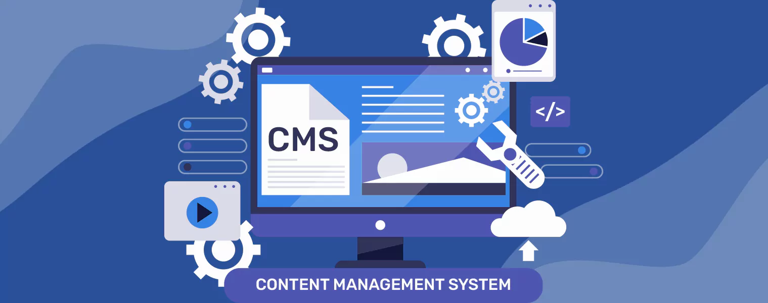
What Are Data Visualization Consulting Services, and Why Does Your Business Need Them?

Data visualization consulting services help organizations turn complex, raw data into clear, actionable visual insights that drive smarter decisions. These services go beyond creating graphs — they focus on strategy, analytics, and performance optimization using tools like Power BI, Tableau, and Looker. The goal is to simplify data interpretation, enhance decision-making, and provide real-time business intelligence across departments.
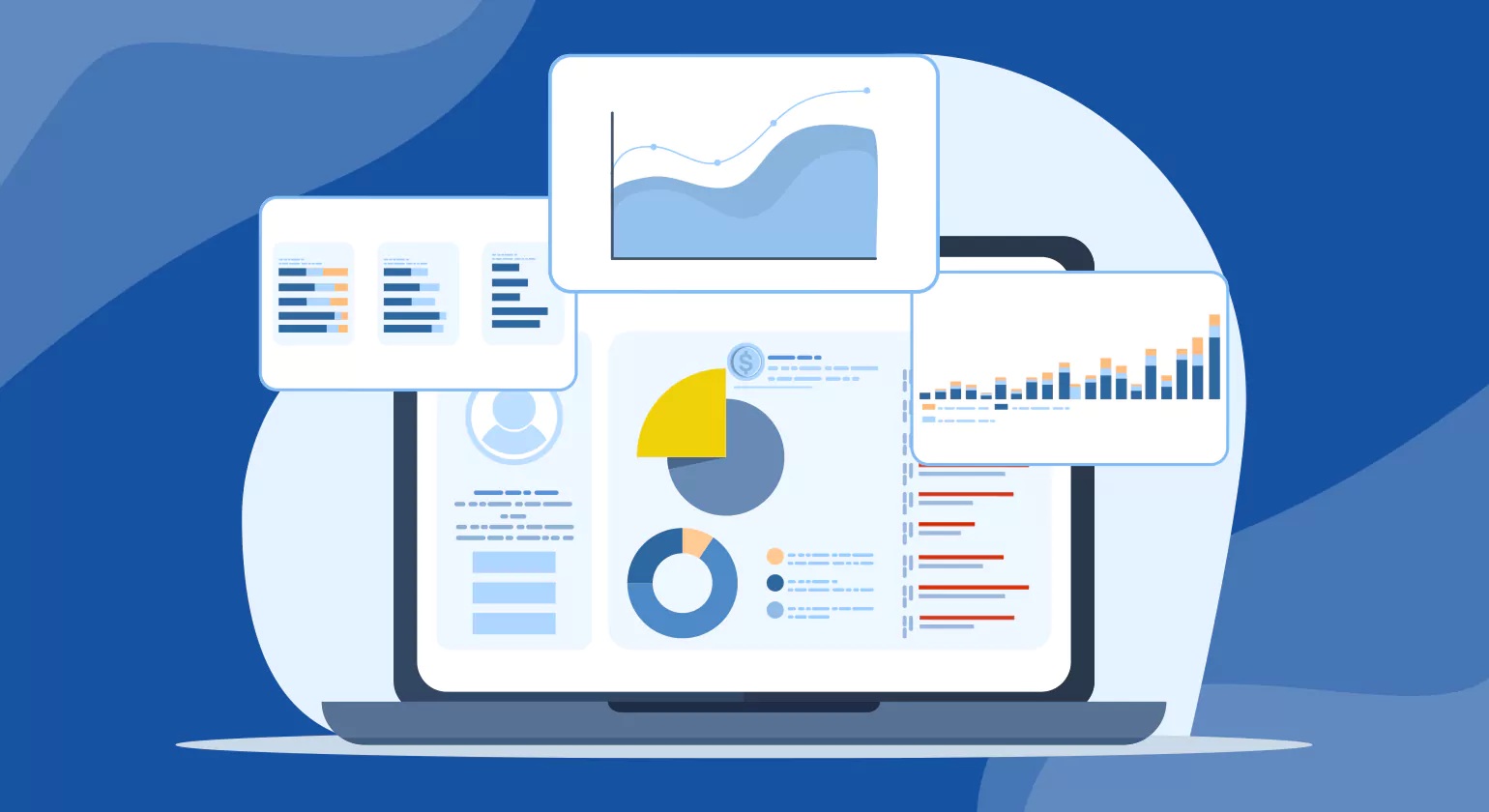
A trusted data visualization service empowers your team to harness the full potential of data. Consultants analyze existing data structures, integrate multiple sources, and create dashboards that visualize KPIs, trends, and opportunities. This makes it easier for decision-makers to monitor progress, identify issues early, and implement data-backed strategies quickly and effectively.
Key Features of Data Visualization Consulting Services
- Custom Dashboard Development – Tailored, interactive dashboards that display the most relevant business metrics for instant insight.
- Data Integration & Cleansing – Consolidation of multiple data sources to ensure accuracy, consistency, and reliability across all reports.
- Predictive Analytics & Trend Identification – Advanced modeling to forecast business outcomes and spot future opportunities.
- Performance Monitoring & Reporting – Continuous evaluation and reporting systems that track KPIs and support ongoing business improvement.
Businesses need these services to transform raw data into a strategic asset. Instead of relying on static reports, they gain access to real-time, visually rich dashboards that improve forecasting, marketing performance, and operational efficiency. With expert guidance, companies can reduce risks, identify growth channels, and make data-driven decisions confidently.
10 Essential Tools and Technologies for Data Visualization Consulting Services

In 2025, data visualization consulting isn’t just about creating charts—it’s about enabling clarity, insight, and action through modern VA tools. Businesses rely on advanced visualization platforms to process massive datasets, uncover trends in real time, and communicate insights effectively. Below are ten essential data visualization tools and technologies you should know, along with why they matter today.
1. Tableau
Tableau remains a leader in interactive dashboards and enterprise-grade analytics. Its drag-and-drop interface and AI-powered insights make it a go-to for visual storytelling and real-time business monitoring.
Key Features:
- Real-time data integration from multiple sources
- AI-powered “Ask Data” and predictive analytics
- Cloud and on-premise deployment options
- Interactive dashboards and data storytelling tools
Why it matters in 2025: Tableau’s deep AI integrations and enhanced data governance make it indispensable for enterprise-level analytics and agile decision-making.
2. Microsoft Power BI
Power BI offers deep integration with Microsoft 365 and Azure, helping organizations visualize and analyze data from multiple sources.
Key Features:
- Seamless integration with Excel, Azure, and Teams
- Natural language queries via Copilot AI
- Extensive library of visualization templates
- Real-time dashboards and KPI tracking
Why it matters: In 2025, Power BI helps teams access business intelligence collaboratively through cloud-based and embedded analytics.
3. Google Looker Studio (formerly Data Studio)
Looker Studio is a cloud-based tool for building dynamic, shareable dashboards connected to Google Analytics, BigQuery, and other data sources.
Key Features:
- Easy drag-and-drop interface
- Direct integration with Google Analytics, Ads, and BigQuery
- Collaboration and sharing through Google Workspace
- Customizable and interactive dashboards
Why in 2025: It’s ideal for marketing, SEO, and web analytics teams seeking fast, free, and cloud-native visualization capabilities.
4. Qlik Sense
Qlik Sense combines associative data models with AI to uncover hidden relationships within data.
Key Features:
- Associative model for non-linear data analysis
- Augmented analytics with machine learning
- Self-service data preparation
- Advanced governance and scalability
Why it matters: As self-service BI grows, Qlik Sense empowers teams to explore relationships and insights across large, complex datasets interactively.
5. D3.js
D3.js is a JavaScript library that gives developers full control over data-driven documents and custom visualizations.
Key Features:
- High flexibility and control over design
- SVG, Canvas, and HTML rendering
- Integrates with web frameworks like React and Vue
- Vast community support and reusable modules
Why it matters: In 2025’s era of web-driven storytelling, D3.js enables developers to build bespoke, visually rich data experiences.
6. Plotly
Plotly supports both code-based (Python, R, JavaScript) and visual interfaces, making it ideal for data scientists and developers.
Key Features:
- Supports Python, R, and JavaScript APIs
- Dash framework for building web-based analytics apps
- Interactive charts with hover and zoom
- Cloud and enterprise deployment options
Why it matters: Plotly is vital for data teams needing both code-level control and enterprise scalability in 2025.
7. Apache Superset
Superset is an open-source data visualization and exploration platform designed for enterprise scalability.
Key Features:
- SQL-based exploration and visual query editor
- Rich chart library and dashboard customization
- Role-based access control
- Integration with major databases and cloud warehouses
Why in 2025: Ideal for cost-effective, open-source analytics environments seeking flexibility and control without heavy licensing costs.
8. Grafana
Grafana excels in monitoring, observability, and real-time visualization, especially for DevOps and IoT data.
Key Features:
- Multi-source integrations (Prometheus, Elasticsearch, AWS)
- Real-time streaming and alerting
- Customizable dashboards and plug-ins
- Role-based user management
Why it matters: As real-time observability becomes essential, Grafana empowers teams to track metrics, uptime, and performance continuously.
9. Sisense
Sisense enables embedded analytics and white-label dashboards for SaaS and enterprise applications.
Key Features:
- In-chip analytics for faster performance
- White-label dashboards for SaaS solutions
- Embedded BI through APIs and SDKs
- AI-powered predictive and prescriptive insights
Why in 2025: Sisense helps businesses integrate analytics directly into customer-facing platforms—turning insights into immediate action.
10. Zoho Analytics
Zoho Analytics provides cloud-based reporting and visualization with an emphasis on simplicity and automation.
Key Features:
- AI assistant “Zia” for conversational analytics
- Auto-blending data from multiple sources
- Scheduled reports and automated insights
- Collaboration tools and mobile dashboards
Why it matters: With automation and accessibility at its core, Zoho Analytics democratizes analytics across business functions in 2025.
What is Data Visualization and its Importance in Business Intelligence?

Data Visualization plays a crucial role in today’s business environment by enabling organizations to interpret complex data quickly and effectively. As data volumes grow exponentially, traditional methods of data analysis and reporting become less efficient. According to a report by the International Data Corporation (IDC), organizations that leverage data visualization tools experience a 30% increase in the speed of decision-making processes. By transforming raw data into interactive and intuitive visuals, businesses can swiftly identify trends, patterns, and anomalies, facilitating more informed and timely decisions.
Moreover, Data Visualization enhances communication across different departments within an organization. A study by Aberdeen Group found that companies using visual data discovery tools are 28% more likely to find timely information than those relying on traditional data reporting. Visualizations make data more accessible and understandable to non-technical stakeholders, bridging the gap between data scientists and business leaders. This improved communication leads to better alignment of business strategies, fostering collaboration and driving innovation.
Moreover, Data Visualization Consulting communication across different departments within an organization. A study by Aberdeen Group found that companies using visual data discovery tools are 28% more likely to find timely information than those relying on traditional data reporting. Visualizations make data more accessible and understandable to non-technical stakeholders, bridging the gap between data scientists and business leaders. This improved communication leads to better alignment of business strategies, fostering collaboration and driving innovation.
By presenting data in a visually compelling and easily digestible format, businesses can enhance operational efficiency, optimize processes, and ultimately achieve a competitive advantage in their respective markets.
Key Responsibilities of a Data Visualization Consultant

Data visualization consultants play a crucial role in helping organizations derive meaningful insights from their data by transforming complex information into visual representations that are easy to understand and act upon. Here are five key responsibilities that define their role:
1. Understanding Client Needs
Data visualization consultants begin by thoroughly understanding the client’s objectives, data sources, and the specific questions they seek to answer. This involves gathering requirements through meetings with stakeholders and conducting thorough analyses of available datasets.
2. Designing Effective Visualizations
Once the requirements are clear, consultants begin the data visualization consulting process by designing visuals that clearly communicate insights. They choose suitable chart types, colors, and layouts to ensure clarity, accuracy, and maximum impact for end users.
3. Data Analysis and Interpretation
Beyond creating visuals, consultants are skilled in data analysis techniques. They identify trends, outliers, and correlations within the data, providing valuable interpretations that drive decision-making and strategic planning.
4. Tools and Technology Expertise
Proficiency in data visualization tools such as Tableau, Power BI, or Python libraries like Matplotlib and Plotly is essential. Consultants stay updated with the latest features and capabilities of these tools to leverage them effectively for client projects.
5. Collaboration and Communication
Effective communication is key to a data visualization consultant’s role. They collaborate closely with data scientists, analysts, and business stakeholders to ensure that the visualizations meet the project’s goals and are aligned with the broader strategic objectives of the organization.
Data visualization specialists bridge the gap between raw data and actionable insights through their expertise in visual storytelling and data analysis. By fulfilling these key responsibilities, they empower organizations to make informed decisions and drive business success.
10 Benefits of Hiring a Data Visualization Consultant in 2025

In 2025, data complexity has reached new heights. Companies are generating massive amounts of information from marketing, operations, sales, and customer platforms. Without proper structure, that data quickly becomes overwhelming. Hiring a data visualization consultant helps transform complex information into clear, actionable insights — empowering faster decisions, better forecasting, and smarter strategies.
1. Simplifies Complex Data Sets
Modern businesses manage vast data from multiple sources — CRMs, supply chains, and digital campaigns. A data visualization consulting expert designs unified dashboards that organize, simplify, and visualize this complexity. Instead of reviewing dozens of spreadsheets, leaders get one clear performance view that ensures accuracy and eliminates clutter.
2. Provides Real-Time Insights
In today’s fast-paced market, waiting for monthly or quarterly reports slows progress. Consultants implement real-time dashboards that automatically refresh, enabling instant performance tracking. For instance, retailers can monitor product sales live and adjust inventory immediately — making decisions proactively rather than reactively.
3. Enhances Informed Decision-Making
Successful strategy relies on data-backed decisions. A consultant ensures managers and executives have access to visual data and analytics that guide confident, risk-free choices. Interactive charts and dashboards highlight key comparisons, trends, and forecasts — turning guesswork into precision.
4. Identifies Market Trends Quickly
Spotting emerging market patterns early is a competitive edge. Through data visualization Customer Service Consultant, businesses can identify customer service con behavior shifts, seasonal trends, and competitor movements at a glance. This allows teams to adapt pricing, promotions, or product strategies before rivals react.
5. Improves Operational Efficiency
Inefficiencies often hide in traditional spreadsheets but stand out visually. A data visualization consultant builds dashboards that pinpoint process delays, underperforming regions, or redundant workflows. With these insights, companies streamline operations, reduce waste, and optimize performance.
6. Unlocks the Full Power of BI Tools
Many organizations underuse business intelligence tools like Power BI and Tableau. Consultants unlock their advanced capabilities — predictive analytics, automated reporting, and cross-department integrations — turning BI platforms into engines of innovation and growth.
7. Creates Interactive Dashboards
Static reports present data; interactive dashboards engage users. Consultants design user-friendly dashboards that allow filtering by product, region, or time period. This encourages exploration and collaboration, bridging the gap between technical analysts and business users.
8. Delivers Actionable Insights from Big Data
With AI, IoT, and digital platforms expanding, big data can overwhelm teams. Consultants transform this raw information into visual insights that drive action. From identifying top-performing customer segments to improving pricing models, they make big data meaningful and measurable.
9. Strengthens Business Intelligence
A data visualization consultant enhances BI maturity by aligning dashboards with business objectives. Executives get strategic overviews, while teams receive tailored operational insights. This alignment builds a culture of data-driven decisions across the organization.
10. Offers Long-Term Competitive Advantage
Finally, investing in data visualization consulting services ensures sustainable growth. With expert dashboards and analytics systems, businesses can track performance, forecast changes, and respond faster than competitors. Whether in healthcare, retail, or finance, these insights create long-term market leadership.
Types of Data Visualization Consulting Services
Data consulting services encompass a wide range of offerings designed to help organizations transform their data into actionable insights. These services enable businesses to effectively analyze, understand, and communicate their data through visual means. Here are some key types of data visualization services:
1. Dashboard Design and Optimization
Dashboard design and optimization services focus on creating intuitive, informative dashboards that allow businesses to quickly grasp key metrics and make data-driven decisions. Consultants in this area specialize in selecting appropriate visualizations, arranging information for clarity, and optimizing user experience.
2. Custom Visualization Development
Consultants in custom visualization development create bespoke data visualizations tailored to specific business needs. This service often involves using advanced tools and technologies to design visualizations that go beyond standard charts and graphs, potentially incorporating interactive elements or complex data integrations.
3. Data Storytelling
Data storytelling consultants help businesses communicate insights effectively through compelling narratives backed by data visualizations. They combine analytical skills with storytelling techniques to convey complex findings in a clear and persuasive manner, making data more accessible and actionable for stakeholders.
4. Data Visualization Training and Workshops
Consultants in data visualization consulting provide training sessions to improve teams’ data literacy and visualization skills. These sessions cover best practices, tools like Tableau or Power BI, and help teams interpret data visuals for better decision-making.
5. Data Visualization Audits
Data visualization audits assess the effectiveness and usability of existing visualizations within an organization. Consultants review visualizations against industry standards and best practices, identify areas for improvement, and provide recommendations to enhance clarity, accuracy, and impact of data presentations.
6. Geospatial and Mapping Solutions
Consultants specializing in geospatial and mapping solutions help businesses visualize location-based data effectively. They design maps and geospatial visualizations that uncover spatial patterns, support location intelligence, and aid in strategic decision-making across various industries like logistics, urban planning, and marketing.
Data Visualization Tips and Best Practices

Data visualization consulting plays a crucial role in helping organizations translate complex data into actionable insights. Whether you’re just starting out or looking to refine your approach, adopting these best practices can significantly enhance the effectiveness of your consulting services:
1. Understand Stakeholder Needs
Begin by thoroughly understanding your client’s objectives, target audience, and the specific questions they need answers to. This foundational understanding ensures that your visualizations are relevant and impactful.
2. Choose the Right Visualization Types
Not all data is best represented in the same way. Select visualization types (e.g., charts, graphs, maps) that effectively communicate the story hidden within the data. Consider factors such as data distribution, relationships, and the message you want to convey.
3. Simplify Complexity
Data often comes with inherent complexity. Your role as a consultant is to simplify this complexity without losing the essential details. Use intuitive design principles such as clarity, consistency, and hierarchy to guide viewers through the information.
4. Focus on Insights, Not Just Data
Avoid overwhelming stakeholders with raw data. Instead, focus on extracting meaningful insights that drive decision-making. Highlight trends, outliers, and correlations that provide actionable intelligence.
5. Interactive and Engaging Visualizations
Leverage interactive elements to enhance engagement and understanding. Allow stakeholders to explore data dynamically, drill down into details, and uncover insights relevant to their specific interests.
6. Iterate and Gather Feedback
Data visualization is an iterative process. Encourage feedback from stakeholders throughout the consulting engagement. Use this input to refine visualizations, improve clarity, and ensure alignment with evolving business needs.
7. Ensure Data Accuracy and Integrity
Accurate data is the foundation of effective visualization. Ensure that the data you use is clean, accurate, and up-to-date. Validate data sources and perform thorough checks to prevent errors and misinterpretations. Trustworthy data builds credibility and trust with stakeholders.
8. Maintain Consistent Branding and Style
Consistency in design and branding helps reinforce your client’s identity and enhances the professional appearance of your visualizations. Use consistent colors, fonts, and styles across all visualizations. This not only makes your work more aesthetically pleasing but also easier for stakeholders to follow and understand.
By adopting these best practices for Data Visualization Consulting, data visualization consultants can deliver compelling visual narratives that empower organizations to make informed decisions and drive business success.
How to Choose the Best Data Visualization for Your Reporting

Choosing the right data visualization company is crucial for maximizing the value of your data assets and achieving your business objectives effectively. When evaluating potential consultants or firms, consider their track record in delivering projects similar to your needs. Look for expertise in your industry or niche, as this ensures they understand the specific challenges and opportunities relevant to your business context.
Additionally, assess their portfolio of past work and client testimonials to gauge their ability to deliver high-quality, impactful visualizations. A good data visualization consulting company will not only possess technical proficiency with tools like Tableau, Power BI, or custom solutions but also demonstrate a knack for storytelling through data and an understanding of user experience principles. Finally, consider their approach to collaboration and communication—clear, transparent communication and a collaborative mindset are essential for ensuring that the final visualizations meet your expectations and effectively convey insights to stakeholders across your organization.
Real-World Examples of Data Visualization Consulting Success

Data visualization consultant plays a crucial role in helping businesses and organizations derive actionable insights from complex data. Here are five compelling examples of successful data visualization projects:
1. Netflix
Netflix utilizes data visualization extensively to analyze viewer preferences and behavior. By visualizing user data such as viewing habits, genre preferences, and geographical trends, Netflix optimizes content recommendations and personalization algorithms. This has significantly boosted viewer engagement and retention rates.
2. Johns Hopkins University COVID-19 Dashboard
During the COVID-19 pandemic, Johns Hopkins University developed a widely acclaimed data dashboard. This dashboard, powered by effective data visualization techniques, provided real-time updates on infection rates, mortality rates, and vaccination progress globally. It became a critical resource for governments, healthcare professionals, and the public, aiding informed decision-making and public health strategies.
3. NASA
NASA utilizes data visualization to interpret and communicate complex scientific data gathered from space missions. Visualizations of satellite imagery, planetary data, and climate models help scientists and the public alike understand phenomena like climate change, weather patterns, and planetary exploration findings.
4. Zillow
Zillow, a real estate marketplace, uses data visualization to present housing market trends, pricing dynamics, and neighborhood insights to both homebuyers and sellers. Interactive maps and charts provide users with a comprehensive view of property values, rental rates, and market forecasts, empowering informed decisions in real estate transactions.
5. Uber
Uber leverages data visualization to optimize its transportation services. Visualizations of ride patterns, traffic flow, and demand fluctuations enable Uber to improve driver allocation, predict surge pricing, and enhance overall service efficiency. This ensures a seamless experience for riders while maximizing driver earnings.
Conclusion
In conclusion, data visualization consulting services play a pivotal role in today’s data-driven landscape by transforming complex data into actionable insights and compelling narratives. Whether through custom visualization development, dashboard optimization, or data storytelling, consultants enable organizations to harness the power of data effectively. By enhancing data literacy, improving decision-making processes, and fostering clearer communication of insights, these services not only drive business success but also pave the way for innovation and competitive advantage in an increasingly interconnected world. Embracing effective data visualization strategies is not just a trend but a strategic imperative for organizations aiming to thrive in the era of big data.
FAQ’s
1. What are data visualization outsourcing services and how do they work?
Data visualization outsourcing services involve partnering with external experts to manage dashboard design, data integration, and analytics visualization. In 2025, businesses outsource to gain access to advanced BI tools, faster execution, and cost-efficient scalability — transforming raw data into actionable, real-time business insights.
2. What does a Data Visualization Consultant do?
A data visualization consultant helps businesses turn raw data into clear visuals. They analyze information, design impactful charts and dashboards, and implement tools that make it easier to understand trends, patterns, and insights for smarter decision-making.
3. What are the 4 levels of visualization?
The four levels of visualization include descriptive, diagnostic, predictive, and prescriptive visualizations. Descriptive shows what happened, diagnostic explains why it happened, predictive forecasts future trends, and prescriptive suggests solutions. Each level builds on the previous, offering deeper data insights.
4. How do data visualization consultancies improve business intelligence and reporting?
Data visualization consultancies enhance business intelligence by turning complex datasets into clear, actionable visuals. In 2025, they integrate BI tools like Power BI and Tableau to create interactive dashboards, streamline analytics, and enable faster, data-driven decision-making across all organizational levels.
5. Which are the top data visualization services companies in 2025?
Top data visualization services companies in 2025 include Tableau, Power BI, Sisense, Qlik, and Yellowfin BI. These providers offer advanced analytics, AI integration, and customized dashboard design, helping businesses gain deeper insights, improve performance tracking, and communicate data effectively across teams.
6. What Industries can Benefit from Data Visualization Consulting Services?
Industries such as finance, healthcare, marketing, education, and logistics can benefit from data visualization consulting services. These services help in interpreting large datasets, identifying trends, and making data-driven decisions across various sectors.
7. How does data visualization design consulting enhance dashboard usability?
Data visualization design consulting focuses on creating intuitive, user-friendly dashboards that simplify analytics. By optimizing layout, colors, and interactivity, consultants ensure quick insight discovery. In 2025, design-driven visualization boosts engagement, accessibility, and efficiency, enabling users to make confident, informed decisions from complex datasets.
8. What Services do Data Visualization Consultants Offer?
Data visualization consultants offer services like data analysis, dashboard design, reporting solutions, custom visualizations, training, and tool implementation. They provide tailored solutions to help businesses maximize the value of their data.